Design • 31 Mai, 2020 • 8 Lesedauer (Min.)
Scandinavian Interior Color Palette – How To Perfect Yours
Scandinavian interior design lends itself well to bright, modern spaces, but can be incorporated into any kind of home due to its versatile color scheme. Read on for four popular takes on the Scandinavian theme, and to learn how to replicate them in your space!
Von Edvin BrobeckPerfect your Scandinavian Interior Color Palette
The Scandinavian interior color palette lends itself well to bright, modern spaces, but can be incorporated into any kind of home due to its versatile design style.
Read on for four popular takes on the Scandinavian color theme, and to learn how to replicate these nordic color schemes in your own space!
MEET MONOCHROME
Creating A Monochrome Scandinavian Interior Color Palette
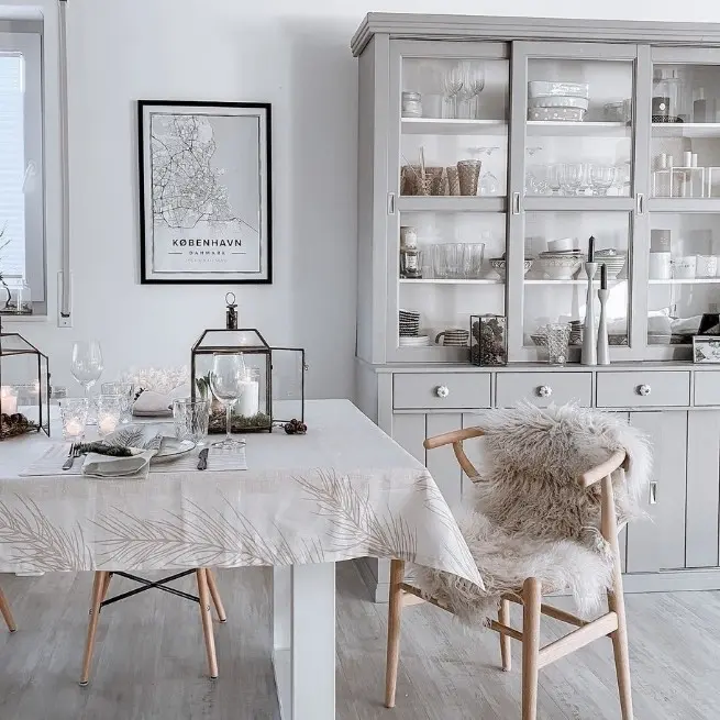
Traditionally, Scandinavian home styling favours a humble, monochrome palette to create a simple and peaceful environment. Consider incorporating different shades of white, grey and pops of black to create an uncomplicated interior feel that is super easy to accessorise.
If you opt for this scheme, we recommend keeping your scandinavian interior color palette clean and bright, with the lighter tones centre-stage. Blacks and dark greys can sometimes crowd your space, but when used sparingly as part of trendy patterns and fabrics, they add the coolest modern flair.
There are a few areas of your home that lend themselves particularly well to the more monochrome interior palette. Bathrooms, kitchens and porches tend to be smaller rooms that can still feel cozy, even with more minimal colors. This grey kitchen is the perfect example of a nordic color scheme done right. The sheepskin blankets and homey dinner table decor help to create a warm and cozy feeling and stop the room from feeling too cold!
Color starter kit: Deep Onyx, elegant charcoal grey, and stone white
WARM WOOD
Warm Nordic Color Schemes
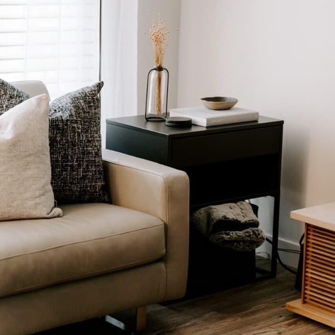
Drawing inspiration from the Nordic environment and forest landscapes, warmer color groups can work well in Scandinavian interiors, together alongside natural wood pieces of furniture or art. These inject an instant cozy feel, and will make your home feel oh so sophisticated.
Almost every room in your space can be adapted to fit this Scandinavian interior color scheme. Where do you want to feel most cozy? Probably cuddling up on your sofa in your living room, or in your bedroom, right! These two rooms can easily be updated to suit the warm wood theme.
Beige and creams are truly the flavor of the moment, and are super timeless. Warmth and coziness is an important part of the Scandinavian interior, so get ready to stay in and enjoy your new space to the max!
Color starter kit: Wood, beige hues, and warm tan
PRETTY PASTEL
Scandinavian Pastel Palette
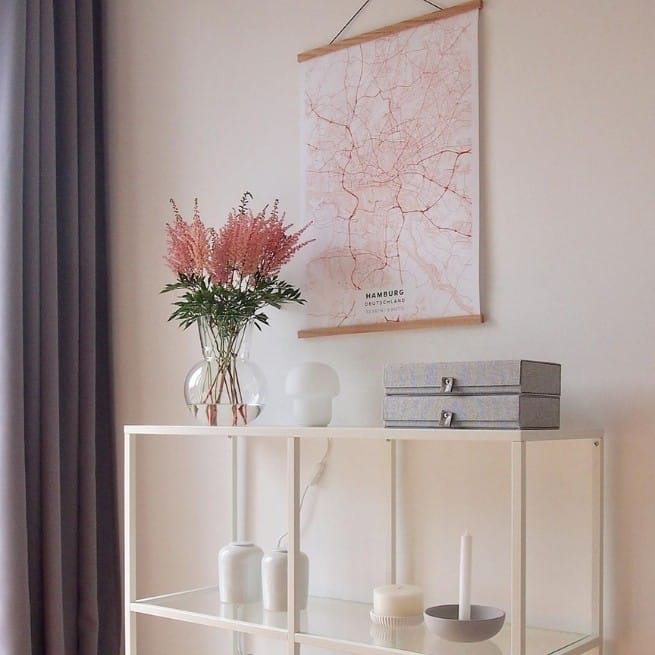
It may not be the first thing to come to mind, but pastel tones are a popular choice in modern Scandinavian interiors. They add a lighter twist to the style, and pastel colors also do a great job of adding brightness when combined with soft grey and white.
Wondering where to start? Focusing the pastel Scandinavian palette on a specific nook, shelf or corner of your interior is an easy way to incorporate this color scheme.
One other tip for adding pastels is to turn to your accessories. Select a mint coloured industrial style lamp for your white side table, or pick pale pink cushions or curtains. Honestly, almost any combination works here!
Color starter kit: Mint greens, baby blues and pale pastel pinks
GOLD AND JEWELS
Scandinavian Jewel Color Palette
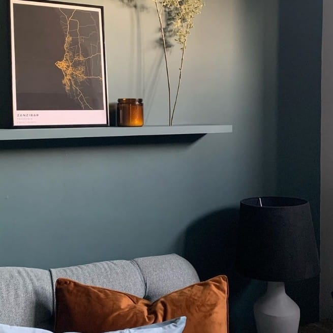
Yes, really! More recently, Scandinavian interiors have started to pick from rich and earthy jewel tones, whilst maintaining the clean lines and minimalistic feel that defines any classic Scandinavian interior. This color theme is THE way to instantly add a luxurious twist to your Scandinavian color theme.
This type of Scandinavian interior color palette is quite literally the jewel in the crown of them all, and that being said, best suits rooms where it can be shown off to the max! Wow your living room guests by update your cushion covers for a budget friendly fix, or creating an unforgettable dining room decor by investing in some beautiful upholstery and impressive dark curtains.
If you opt for this theme, don’t forget the hardware! Small touches of gold are a beautiful choice here. For example, add some minimalist brass candle sticks, or gold frames for your artwork, as they really offset the jewel tones nicely.
Color starter kit: Gold, delectable amber, and deep green
Can’t get enough of Scandi styling?
Dive into Issue 1 of the Scandinavian Edit and click here to read our Introduction to Scandinavian Styling
Free E-Book:
How To Make Your Home More You
Tired of looking at the same old interior? Sign up and receive this limited edition Mapiful e-book, and discover community tips just like this one that teach you the art of personalizing your space, your way!
